Hi Sam,
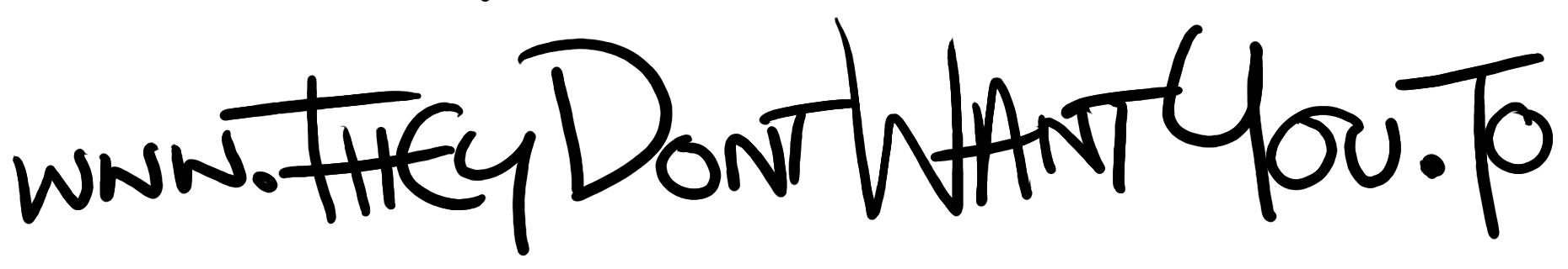
Here is the original handwritten text. If you'd like something between the two, I could do some more; I can appreciate what others said about this one being potentially difficult to read.
Here's the source of my original warning sticker set, too.
. Chris Hayes
On Tue, Sep 3, 2013 at 3:25 PM, Sam Tuke samtuke@fsfe.org wrote:
I changed the spacing to make the text look more even / justified, and increased the size of the warning triangle box to make it's padding more even. Three language tags (EN etc.) are now aligned.
What do you think? I'd like to integrate Chris' original graffiti style handwriting - its more eyecatching and unusual than the later version in my view.
I included the original for comparison (changes are subtle).
Chris: I hope you don't mind me messing with your source files.
Best,
Sam.
-- Sam Tuke Campaign Manager Free Software Foundation Europe IM : samtuke@jabber.fsfe.org Latest UK Free Software news: uk.fsfe.org Is freedom important to you? Join the fellowship.fsfe.org
Designers mailing list Designers@fsfeurope.org https://mail.fsfeurope.org/mailman/listinfo/designers