-----BEGIN PGP SIGNED MESSAGE----- Hash: SHA256
On 12/08/13 16:38, Robert Martinez wrote:
Chris nails it typographically. "Compacta" works much better and also closer to the original.
+1
I made the link a tilted eyecatcher to get the "wait -there is something wrong" feeling instantly and uppercased the text an removed the www for better resamplance and readability.
Awesome! Pending two queries, I'm happy to print this version:
1. Can we use the Compacta font legally? 2. Do you think people will understand that theydontwantyou.to is a URL if we disclude www. ? The .to TLD name is not well known, after all
Very cool to see this design evolve.
Sam.
- -- Sam Tuke Campaign Manager Free Software Foundation Europe IM : samtuke@jabber.fsfe.org Latest UK Free Software news: uk.fsfe.org Is freedom important to you? Join the fellowship.fsfe.org
On Thu 15 Aug 2013 14:38:51 CEST, Sam Tuke wrote:
Awesome! Pending two queries, I'm happy to print this version:
- Can we use the Compacta font legally?
I assumed Chris chose a free font, and the original webpage says "All fonts are absolutely and utterly for free use" but does not cite a licence. Inside the font files there is a copyright notice; "Copyright Unibrain S.A., January 1993, Version 3.1", and it isn't part of google fonts. My research so far showed it is not a free font (OFL, CC-BY-SA or anything alike) so I replaced it with "Oswald bold" which is free (OFL); https://www.google.com/fonts/specimen/Oswald (three weights available) find attached the font & svg
- Do you think people will understand that theydontwantyou.to is a URL if we disclude www. ? The .to TLD name is not well known, after all
I sacrificed clarity for effect, hoping that people are curious enough to get it dispite the missing www (which becomes more and more an artifact of old times imho). Another reason for me not going for clarity here is because with so few text the long url would jump unto your face before anything else making it look cheap.
-robert
I'm inclined to think that the "Explicit Lyrics" style seems inappropriate when the text is changed to "freedom not included"; for me it's jarring, whereas in Sam's original idea of this design, and in my version, the text made sense with this allusion.
As has been discussed, there are good reasons for changing the text to "freedom not included". Here are some configurations of a design that I feel are more appropriate for use with this slogan. It's still somewhat rough, not a finished design yet.
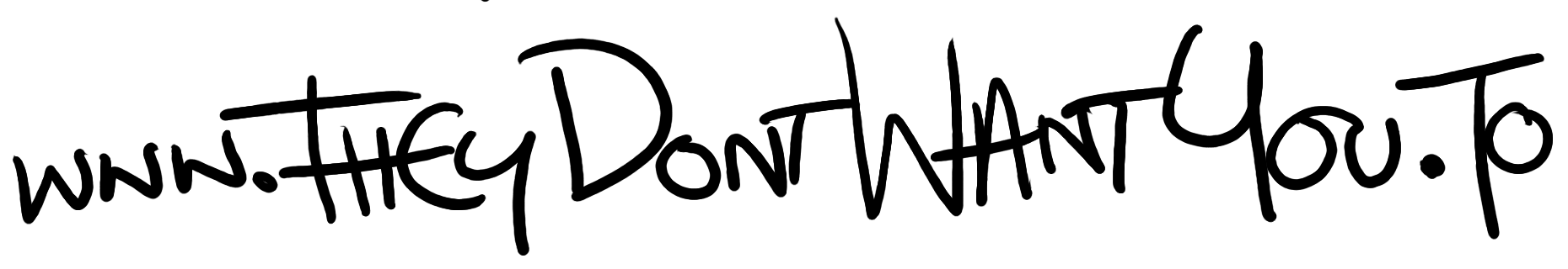
I've also experimented with using handwritten text for the URL, like it's graffiti.
Let me know what you think.
. Chris
Here's a couple more potential logos for the left-hand side part.
. Chris
On Mon, Aug 26, 2013 at 4:06 PM, Chris Hayes berzerkatives@gmail.comwrote:
I'm inclined to think that the "Explicit Lyrics" style seems inappropriate when the text is changed to "freedom not included"; for me it's jarring, whereas in Sam's original idea of this design, and in my version, the text made sense with this allusion.
As has been discussed, there are good reasons for changing the text to "freedom not included". Here are some configurations of a design that I feel are more appropriate for use with this slogan. It's still somewhat rough, not a finished design yet.
I've also experimented with using handwritten text for the URL, like it's graffiti.
Let me know what you think.
. Chris
Thanks, Torsten.
Please can anyone offer feedback as to which logo/design/form they'd like to see finished, I'll have some time to work on this tomorrow night; so feedback before then would be appreciated, cheers.
. Chris
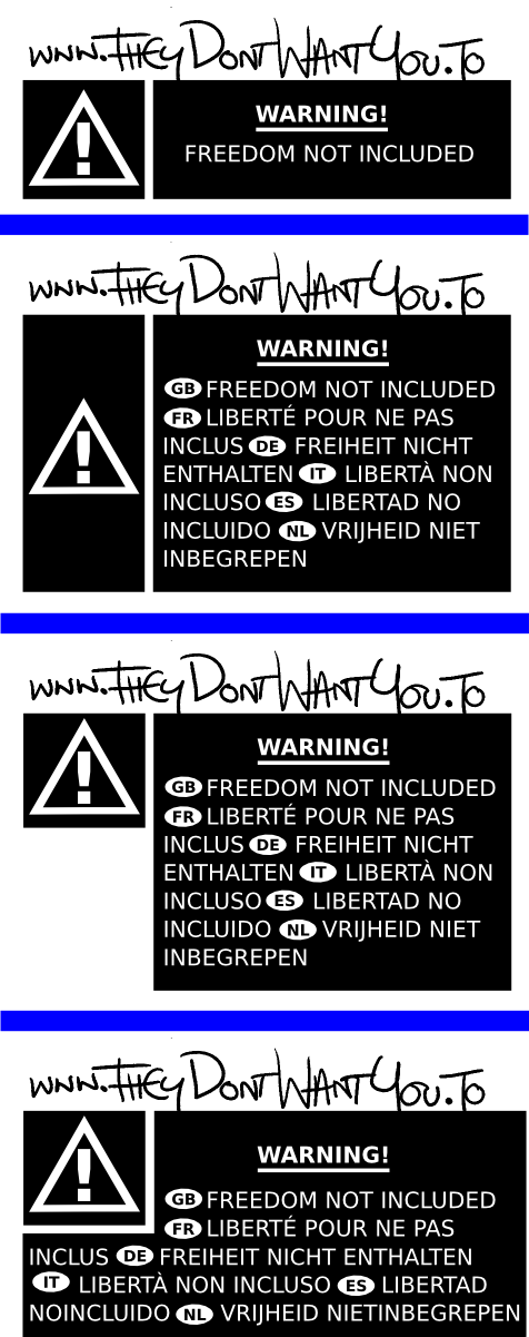
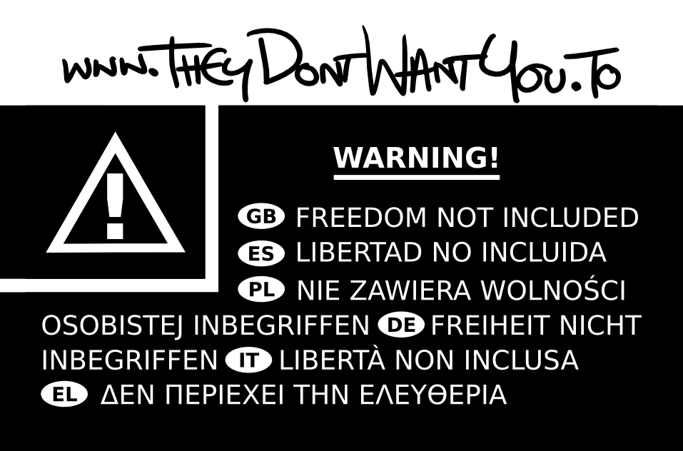
I changed the spacing to make the text look more even / justified, and increased the size of the warning triangle box to make it's padding more even. Three language tags (EN etc.) are now aligned.
What do you think? I'd like to integrate Chris' original graffiti style handwriting - its more eyecatching and unusual than the later version in my view.
I included the original for comparison (changes are subtle).
Chris: I hope you don't mind me messing with your source files.
Best,
Sam.
Hi Sam,
Here is the original handwritten text. If you'd like something between the two, I could do some more; I can appreciate what others said about this one being potentially difficult to read.
Here's the source of my original warning sticker set, too.
. Chris Hayes
On Tue, Sep 3, 2013 at 3:25 PM, Sam Tuke samtuke@fsfe.org wrote:
I changed the spacing to make the text look more even / justified, and increased the size of the warning triangle box to make it's padding more even. Three language tags (EN etc.) are now aligned.
What do you think? I'd like to integrate Chris' original graffiti style handwriting - its more eyecatching and unusual than the later version in my view.
I included the original for comparison (changes are subtle).
Chris: I hope you don't mind me messing with your source files.
Best,
Sam.
-- Sam Tuke Campaign Manager Free Software Foundation Europe IM : samtuke@jabber.fsfe.org Latest UK Free Software news: uk.fsfe.org Is freedom important to you? Join the fellowship.fsfe.org
Designers mailing list Designers@fsfeurope.org https://mail.fsfeurope.org/mailman/listinfo/designers
-----BEGIN PGP SIGNED MESSAGE----- Hash: SHA256
On 05/09/13 08:08, Chris Hayes wrote:
Here is the original handwritten text.
Thanks for the sources Chris, I couldn't get it to look quite right, maybe we should just stick with your latest, most easily read version?
I'll ask for feedback in a separate email now.
Sam.
- -- Sam Tuke Campaign Manager Free Software Foundation Europe IM : samtuke@jabber.fsfe.org Latest UK Free Software news: uk.fsfe.org Is freedom important to you? Join the fellowship.fsfe.org
Up to you, I don't mind preparing some additional texts if you try them out.
. Chris
On 11/09/13 08:31, Chris Hayes wrote:
Up to you, I don't mind preparing some additional texts if you try them out.
OK, I was hoping to have time to do more work on these this week, but making plans for the Document Freedom Day meeting on Monday and some issues with our Manchester merchandise stock have kept me occupied instead.
I don't want to be a bottleneck though, so I'll share what I have.
If we slim the border to a minimum around the sticker (maybe 1-2mm whitespace), and position the URL text correctly, then we're ready to do the pre-printing.
We're well over our original deadline now, so the sooner we can get these stickers finalised the better.
I'd be grateful for any help with the tweaking. Chris: whichever hadwriting style you prefer for the URL is fine with me, just so long as it's reasonably readable :)
Best,
Sam.
PS The attached file is in the git repo too
-----BEGIN PGP SIGNED MESSAGE----- Hash: SHA256
On 26/08/13 17:06, Chris Hayes wrote:
I'm inclined to think that the "Explicit Lyrics" style seems inappropriate when the text is changed to "freedom not included"; for me it's jarring, whereas in Sam's original idea of this design, and in my version, the text made sense with this allusion.
I see what you mean Chris. Explicit lyrics are more to do with a personality, a contained message, causing offense. The new warning labels relate more to physical danger to the user, the operation of the product, technology contained within, rather than the taste of the content contained. Therefore I agree that your new designs better reflect the "Freedom not included" message - - the form and text are more consistent.
That said I love the explicit lyrics designs that you and Robert drafted; maybe we can use these for something else, online rather than print, or part of an illustration for a leaflet (let's see if the Compacta font people get back to us).
As has been discussed, there are good reasons for changing the text to "freedom not included". Here are some configurations of a design that I feel are more appropriate for use with this slogan. It's still somewhat rough, not a finished design yet.
I think the designs in your first email work very well. The top image of 'freedom_not_included_warning.png' is stark, easily readable, and a good size to be noticable to customers but probably not glaring to shop staff. The form and spacing works very well with the single line of text and the warning triangle to the left.
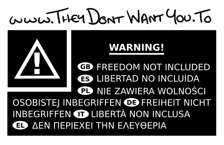
However, despite my preference for that version, the inclusion of translations would be very helpful (though Polish and Greek would be better than French and Dutch, due to our contacts / distributors). The multilingual version will be harder to perfect due to padding, placement of the triangle, and overall sticker size. However the language abbreviations inside ovals that you used are perfect and official-looking.
Could you try developing the final version of freedom_not_included_warning.png (multilingual, non-inverted, text flowing around warning-triangle)? I suggest decreasing the top margin around "warning", increasing the padding around the "freedom not included" text & translations, and maybe increasing thickness of the url and slightly decreasing height? See what you think, maybe that would make the handwriting harder to read (the benefit would be a slightly smaller and more compact sticker).
As Robert said, the URL could probably be made a bit more readable with a few changes. Adding a visible tail to the 'y' curving upwards out of the black (so it dips out as well as in), and decreasing the length of the H crossbar on its left side so it doesn't cross the T of "They" might help. Just some ideas.
I've also experimented with using handwritten text for the URL, like it's graffiti.
I think this works very well and draws attention to both the URL and the sticker as a whole so people don't overlook it as a genuine and uninteresting manufacturer warning.
Exciting work Chris, thanks for your contributions!
Sam. - -- Sam Tuke Campaign Manager Free Software Foundation Europe IM : samtuke@jabber.fsfe.org Latest UK Free Software news: uk.fsfe.org Is freedom important to you? Join the fellowship.fsfe.org
On 27/08/13 13:33, Sam Tuke wrote:
As has been discussed, there are good reasons for changing the text to "freedom not included". Here are some configurations of a design that I feel are more appropriate for use with this slogan. It's still somewhat rough, not a finished design yet.
Hi Chris, Sam, I dont see these designs in my tdwyt inbox - were the def sent to list?
A x
Hey, the emails were stuck in list moderation system -
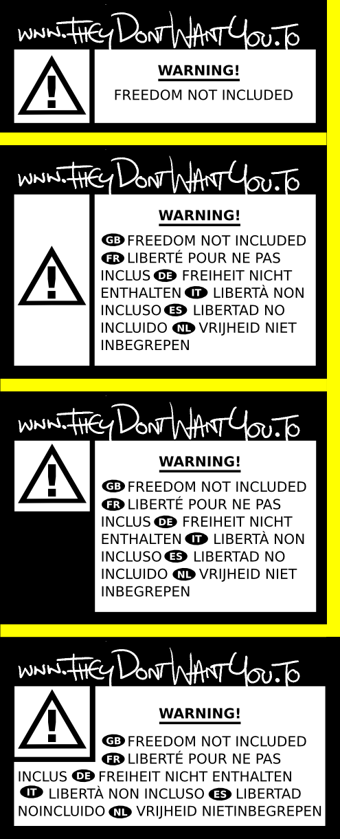
yeah, i quite like these, I think they could use some yellow
like:
http://katenasser.com/wp-content/uploads/CustomerServiceUSA-DVDwarninglabel-...
or
http://2.bp.blogspot.com/-FZi1H6Ai-BU/UOx38S87LEI/AAAAAAAAHB0/qLg5NF85P4s/s4...
I am unsure about the handwritten text, i like it design wise, but I think it makes it clear that the sticker is not official, which may be a problem as we need it to stay "under the radar"
Love the translatable stuff too - VERY cool!
where are you located btw Chris. Are you in the uk?
Best
Anna
On 26/08/13 16:06, Chris Hayes wrote:
I'm inclined to think that the "Explicit Lyrics" style seems inappropriate when the text is changed to "freedom not included"; for me it's jarring, whereas in Sam's original idea of this design, and in my version, the text made sense with this allusion.
As has been discussed, there are good reasons for changing the text to "freedom not included". Here are some configurations of a design that I feel are more appropriate for use with this slogan. It's still somewhat rough, not a finished design yet.
I've also experimented with using handwritten text for the URL, like it's graffiti.
Let me know what you think.
. Chris
tdwyt mailing list tdwyt@lists.fsfe.org https://lists.fsfe.org/mailman/listinfo/tdwyt
Aye, yellow is always good; potentially these could be printed on yellow stickers? So far I'd been sticking to monochrome, partly to be economical. The box that the warning sign is in would probably look nice yellow.
I believe Robert introduced the idea that the text of the URL should be noticeably different to the style of the rest of the sticker, so that it draws people's attention to it, partly perhaps because people may simply ignore it if they think it's an legitimate notice (assumed to be irrelevant). But if you're correct about it needing to be more covert, we may need to rethink this?
For now I've changed the text to make it less 'scrawly' and more clearer; please let me know if you have any thoughts about this, or any other aspect of it.
The translations I have on this submission were provided to me by native speakers who I happen to work with.
I will be out for the whole of tomorrow, but I can ensure that any changes are made on Saturday, if needed. Also, please let me know what size and format I should provide these to you in if you're happy to us them.
Incidentally; I'm not happy with the layout of the one with several languages, it looks messy to me, I'll have a look at whether I can make it neater on Saturday, also.
Inkscape SVGs also provided; should I be committing these attachments to an revision control system rather than sending them via e-mail?
. Chris
On Thu, Aug 29, 2013 at 11:27 AM, Anna F J Morris anna.morris@fsfe.orgwrote:
Hey, the emails were stuck in list moderation system -
yeah, i quite like these, I think they could use some yellow
like:
http://katenasser.com/wp-content/uploads/CustomerServiceUSA-DVDwarninglabel-...
or
http://2.bp.blogspot.com/-FZi1H6Ai-BU/UOx38S87LEI/AAAAAAAAHB0/qLg5NF85P4s/s4...
I am unsure about the handwritten text, i like it design wise, but I think it makes it clear that the sticker is not official, which may be a problem as we need it to stay "under the radar"
Love the translatable stuff too - VERY cool!
where are you located btw Chris. Are you in the uk?
Best
Anna
On 26/08/13 16:06, Chris Hayes wrote:
I'm inclined to think that the "Explicit Lyrics" style seems inappropriate when the text is changed to "freedom not included"; for me it's jarring, whereas in Sam's original idea of this design, and in my version, the text made sense with this allusion.
As has been discussed, there are good reasons for changing the text to "freedom not included". Here are some configurations of a design that I feel are more appropriate for use with this slogan. It's still somewhat rough, not a finished design yet.
I've also experimented with using handwritten text for the URL, like it's graffiti.
Let me know what you think.
. Chris
tdwyt mailing list tdwyt@lists.fsfe.org https://lists.fsfe.org/mailman/listinfo/tdwyt
tdwyt mailing list tdwyt@lists.fsfe.org https://lists.fsfe.org/mailman/listinfo/tdwyt
On 30/08/13 01:14, Chris Hayes wrote:
Aye, yellow is always good; potentially these could be printed on yellow stickers? So far I'd been sticking to monochrome, partly to be economical. The box that the warning sign is in would probably look nice yellow.
I like these :) The handwriting is cool because it looks like someone has just written on a "real" sticker when actually the sticker is part of the plan :)
Important question though - @sam @eric - does the price of the stickers depend on ink / colors? I would be surprised if so, I know when I have done things for Ethical Pets, unless its a rizo or screen print or something, its always been pretey much the same for b/w or full color if the end product is glossy (ie: not a photocopy)
But yes, looking good!
A X
-----BEGIN PGP SIGNED MESSAGE----- Hash: SHA256
On 30/08/13 11:50, Anna F J Morris wrote:
Important question though - @sam @eric - does the price of the stickers depend on ink / colors? I would be surprised if so
I'm not sure, here's the place were' planning to get them:
http://www.typographus.de/aufkleber_drucken/aufkleber_drucken_kalkulieren.ht...
All the pricing info should be findable on that page. Unfortunately I can't check right now.
Best,
Sam.
- -- Sam Tuke Campaign Manager Free Software Foundation Europe IM : samtuke@jabber.fsfe.org Latest UK Free Software news: uk.fsfe.org Is freedom important to you? Join the fellowship.fsfe.org
Attached are versions of the "Freedom Not Included" stickers ready for printing (PDF and Scribus). They are slightly wider due to +3mm bleed zone on all sized used by printers.
Any final comments before I send these to be printed? We should try and do this ASAP so we have them delivered in time to distribute them to partner organisations of the campaign.
Best,
Sam.
Hi Sam,
You'll notice that the formerly square tile in which the hazard sign sits is now skewed into rectangle, with longer horizontal sides than it's vertical ones.
Furthermore, both the hazard sign and the 'warning!' text are no longer horizontally centred on their respective surfaces.
I suspect that the design would look cleaner if you were to make these changes.
Kind regards, Chris
On Sat, Sep 28, 2013 at 12:13 PM, Sam Tuke samtuke@fsfe.org wrote:
Attached are versions of the "Freedom Not Included" stickers ready for printing (PDF and Scribus). They are slightly wider due to +3mm bleed zone on all sized used by printers.
Any final comments before I send these to be printed? We should try and do this ASAP so we have them delivered in time to distribute them to partner organisations of the campaign.
Best,
Sam.
-- Sam Tuke Campaign Manager Free Software Foundation Europe IM : samtuke@jabber.fsfe.org Latest UK Free Software news: uk.fsfe.org Is freedom important to you? Join the fellowship.fsfe.org
tdwyt mailing list tdwyt@lists.fsfe.org https://lists.fsfe.org/mailman/listinfo/tdwyt
On 29/09/13 15:04, Chris Hayes wrote:
You'll notice that the formerly square tile in which the hazard sign sits is now skewed into rectangle, with longer horizontal sides than it's vertical ones.
Furthermore, both the hazard sign and the 'warning!' text are no longer horizontally centred on their respective surfaces.
Sorry - I should have explained that the versions I attached were for printing, and so included a +3mm border on all sides for the "bleed zone" of the inks. Therefore everything should be squared and centered when the bleeds are removed.
I've now attached the same design but with the bleed zone black background removed.
Look OK to you?
Best,
Sam.
I improved spacing before the 't' in "Don't" to make it a bit easier to read. Latest version attached.
I've also tried printing the sticker and checking it's actual size, and it looks great to me. It's a bit smaller than a credit card so fits in wallets, and takes just over half the width of a Blu-Ray disc box.
I think it's ready for printing now.
Sam.
Yes, that looks fine. Sorry that I didn't understand first time.
. Chris
On Mon, Sep 30, 2013 at 2:35 PM, Sam Tuke samtuke@fsfe.org wrote:
I improved spacing before the 't' in "Don't" to make it a bit easier to read. Latest version attached.
I've also tried printing the sticker and checking it's actual size, and it looks great to me. It's a bit smaller than a credit card so fits in wallets, and takes just over half the width of a Blu-Ray disc box.
I think it's ready for printing now.
Sam.
-- Sam Tuke Campaign Manager Free Software Foundation Europe IM : samtuke@jabber.fsfe.org Latest UK Free Software news: uk.fsfe.org Is freedom important to you? Join the fellowship.fsfe.org
tdwyt mailing list tdwyt@lists.fsfe.org https://lists.fsfe.org/mailman/listinfo/tdwyt
-----BEGIN PGP SIGNED MESSAGE----- Hash: SHA256
Hey Chris, can you attach source files for the original sticker with handwriting (graffiti) designs that you did? I'd like to play around with them - - I really liked the handwriting in that version.
Best,
Sam. - -- Sam Tuke Campaign Manager Free Software Foundation Europe IM : samtuke@jabber.fsfe.org Latest UK Free Software news: uk.fsfe.org Is freedom important to you? Join the fellowship.fsfe.org